


Crack open the Crayons Pt1
"All colours are the friends of their neighbours, and the lovers of their opposites" - Marc Chagall

I have to hold my hands up, I do love a neutral. Left to my own devices on a photoshoot, I will choose the mud-to-sawdust spectrum of colours, and if pushed, add a touch of algae.
I am a Farrow and Ball paint chart in human form.
But in the middle of winter, craving more brightness, I’ve been turning to a little colour theory to brighten my day. Sometimes a client will give me a brief that is wild with bold colour, and for those shoots the classic colour wheel is my north star.
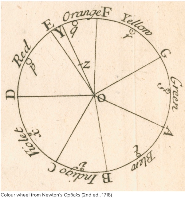
It was that massive overachiever, Isaac Newton, who first developed the colour wheel. Newton had split white light into a spectrum with a prism, he compared the colour hues to music, identified each hue with a corresponding musical note, then arranged those musical notes into a square, before finally placing the colors on a rotating disk to see how they interact with each other visually. Big show off.

So how does it work in a Food Photograph?
PART ONE: Complimentary Colours (“That shade looks lovely on you”)
I tend to be led by the dominant colour of the food I’m shooting, and build out from there. Complimentary Colour pairings match a cool colour (like Blue) which will take a step back within a photograph, with a warm colour (Orange) that steps forward, and this way adding an extra layer of contrast in a shot.
The pairings are easy to identify as they sit on opposite sides of the wheel like ice cream with hot chocolate sauce - it shouldn’t make sense but opposites do indeed attract (Unless we are talking socks and sandals.)
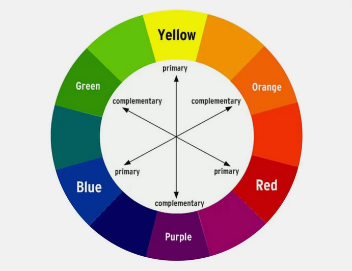
In it’s simplest terms this would mean combining Red with Green, Blue with Orange, and Yellow with Purple. A good rule of thumb is to use the two colours in an 80/20 ratio for maximum impact,
Red & Green
It’s something that often happens intuitively - Adding some pops of green into a shot of fresh Red tomatoes.
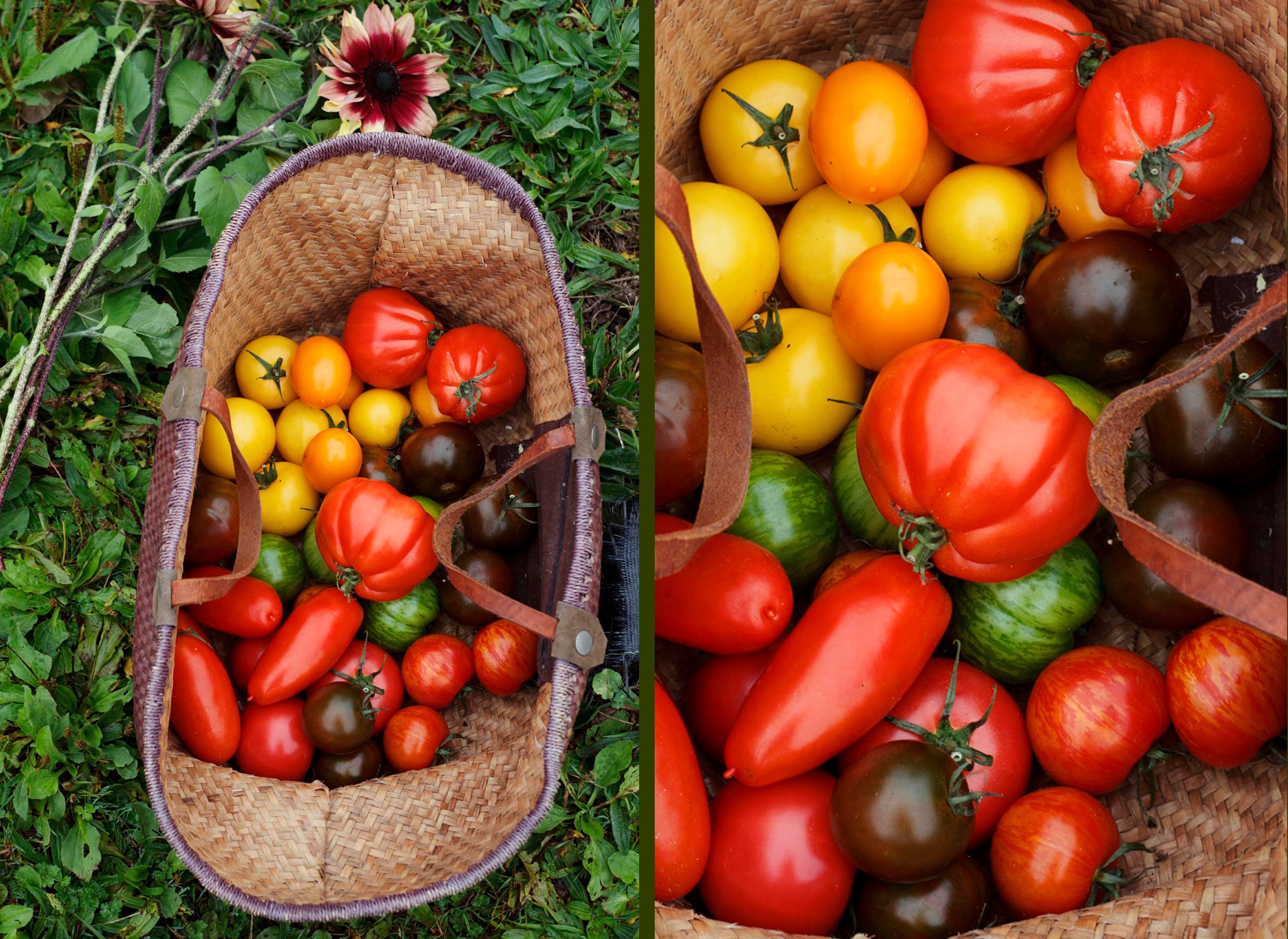
©Kirstie Young for The Simple Things magazine
The colour can come from other foods, or from the props and surfaces that you choose to add in.
©Kirstie Young for the Telegraph magazine
Blue and Orange
Complimentary Colors can help you hunt down a good composition when you’re out shooting on location, like this handy Blue pole next to the Orange-y skins of the onions..
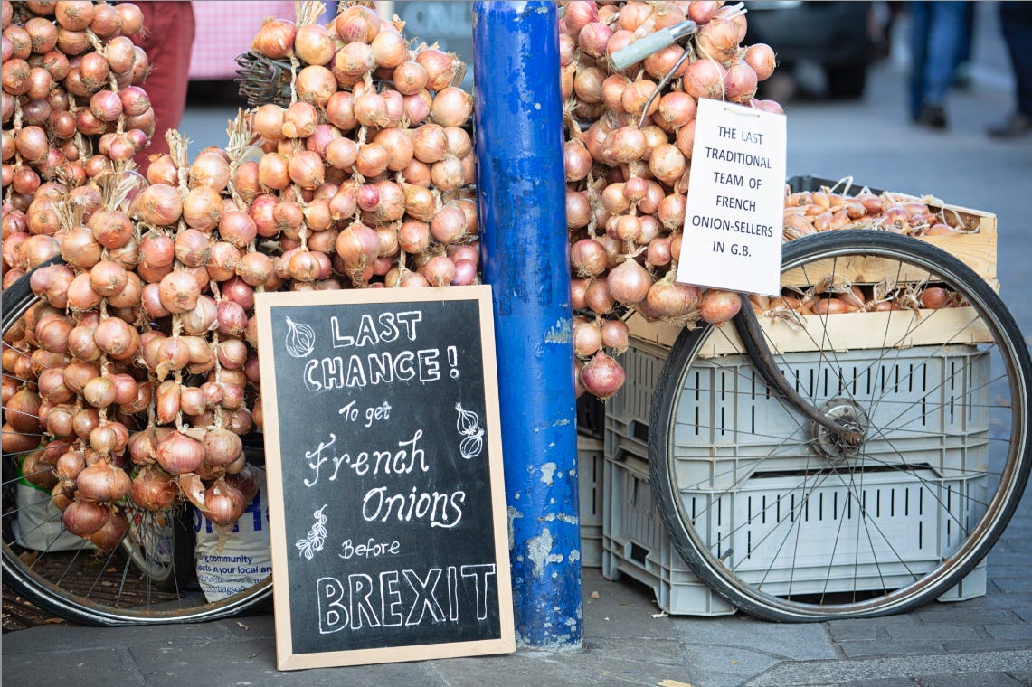
©Kirstie Young for Abergavvany Food Festival
Or the glorious Blue Butterfly Pea Matcha paired with a fortuitously golden croissant in Nailsworth’s Canteen cafe.

©Kirstie Young for The Canteen
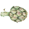
Food brands are well aware of the impact of colour on their packaging, one of the most iconic being these little orbs of joy, officially one of my five-a-day this Christmas.

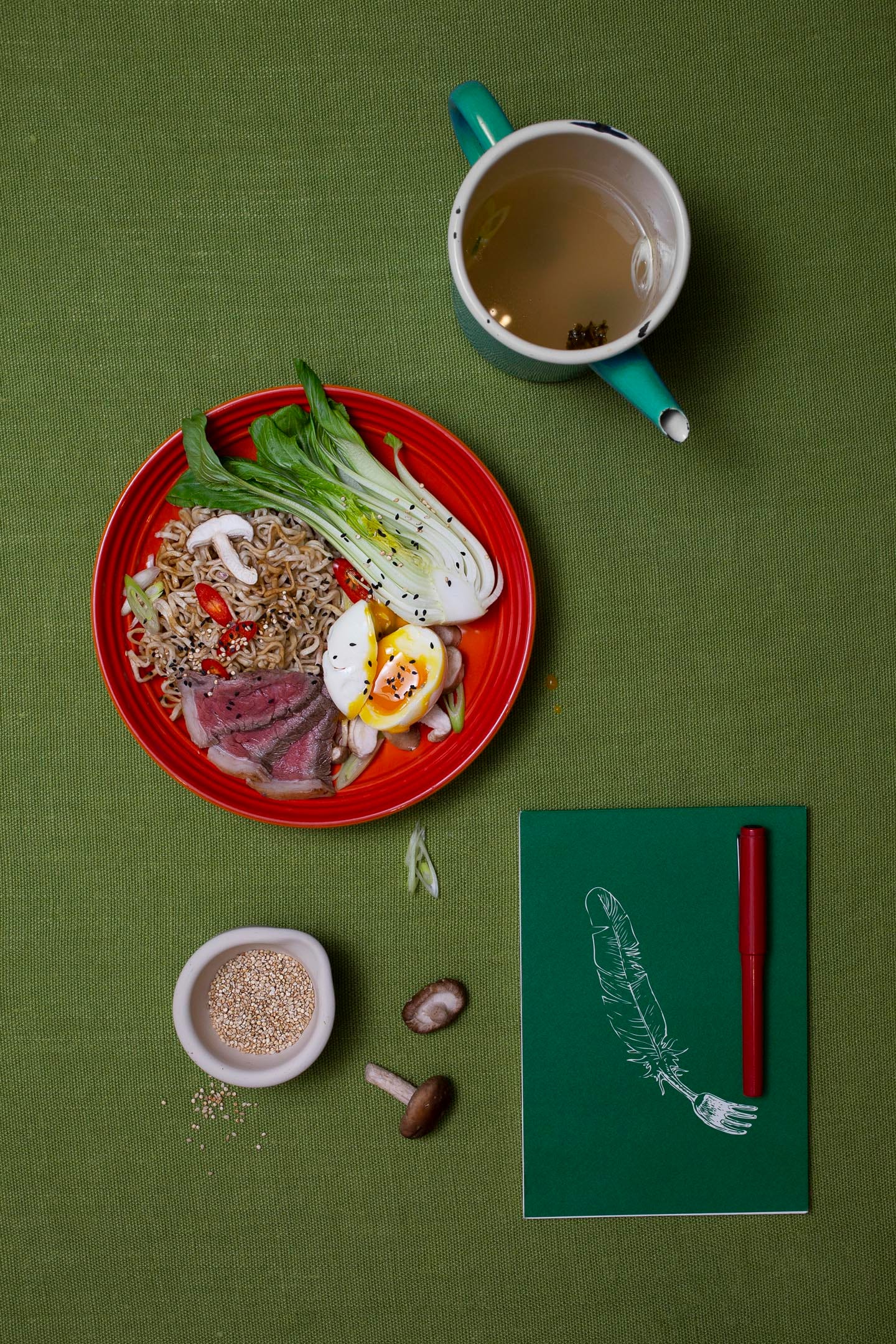
Purple and Yellow
Purple and Yellow is tricky third child in the world of Food Photography, but it can work precisely because it’s unusual, and if you’re careful with the shades it can have a real confetti-cannon-in-a-broom-cupboard kinda impact,
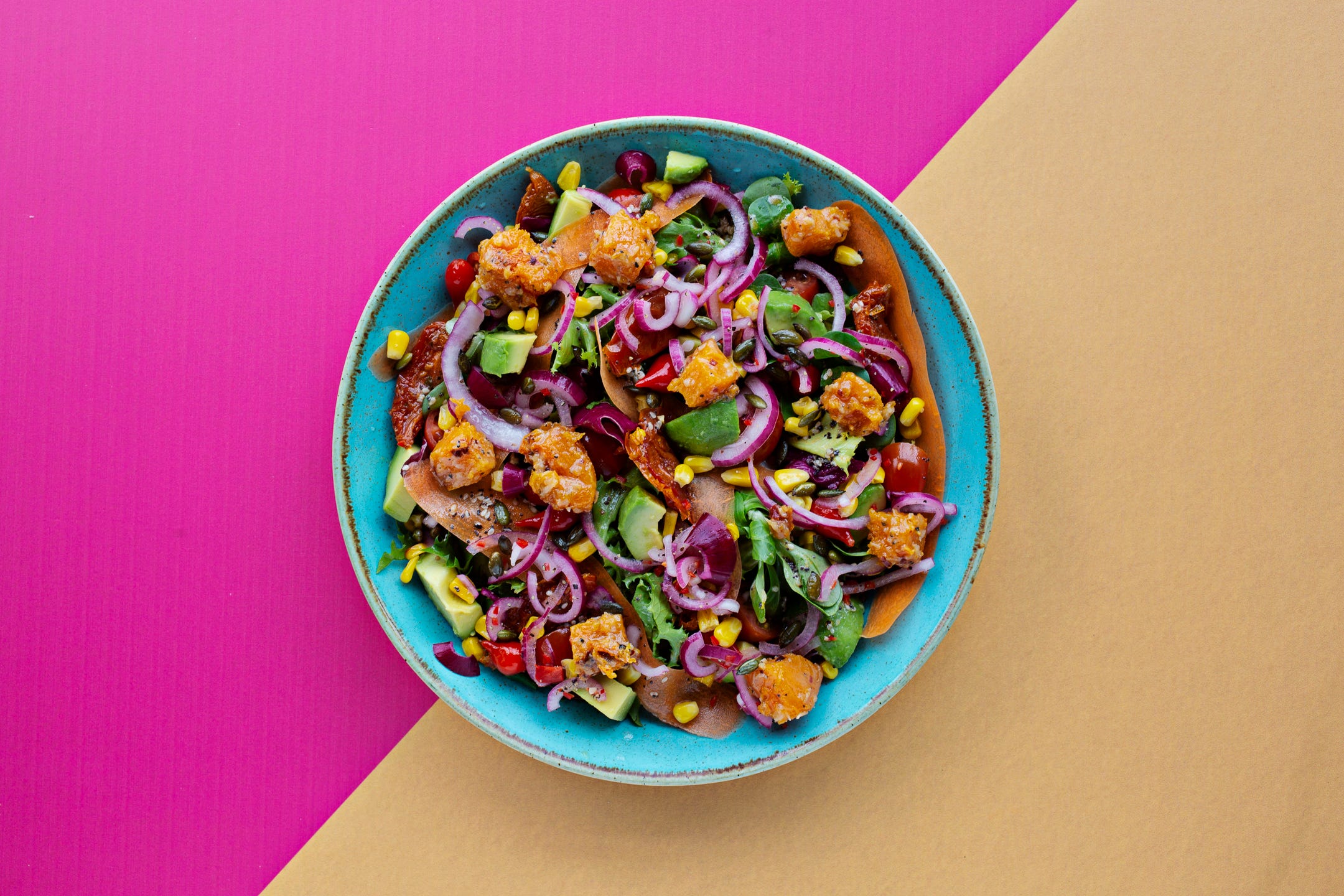
©Kirstie Young for Las Iguanas

©Kirstie Young
Whenever I take a shot that I think looks (for lack of a better word) boring, 90% of the time I can trace it back to a lack of contrast, either in the textures or the color palette. Without it, a shot tends to look flat and uninteresting.
The Colour Wheel is a brilliant tool, but like most things in food photography, be led by your intuition.
I’m trying something a little different this year with these Substacks, as from my own experience of the ones I read, I prefer them to be smallish snacks rather than the full three courses. With that in mind I’ll write Part Two of this for next weeks post, which is about looking at ways of working with colours that sit next to each other rather than opposite, and what that adds to your image.
I do love writing these posts, but would love to reach a wider audience and so if you have enjoyed this one and found it useful I would absolutely love you to please share it:
add a comment:
or become a paid subscriber for £1/week (hitting the button does not commit you to anything, it simply takes you to the options)
Cookbook Club
And for anyone who missed last weeks post, new this year is an online Monthly Cookbook Club for Subscribers. The idea is that you interpret this club however you see fit -
You can choose to simply cook one element to enjoy solo;
You could turn it into an in-person club by inviting a gang of people each tasked with bringing one of the dishes as a pot luck style dinner
You can spend an evening cooking some of the dishes together with friends and then eating your feast together.
I will make the last post of each month a round up of how my own cookbook club went, with photos from the meal and notes on the recipes and Subscribers can then add in their own photos and notes in the comments to create one big beautiful feast from the whole Lens Soup community.
This months book choice is:
Made in India by Meera Sodha and the suggested Menu is :
Starter: Pea Kachori, Lime Pickled Onions, Mint Yoghurt Chutney
Main: Fresh Spinach and Paneer Curry (V)
Pistachio and Yoghurt Chicken Curry
Chapattis or Naan
Dessert: Love Cake with Cardamom and Pomegranite
If you don’t have access to the actual book, the links to the recipes can be found by clicking on each course above.
An interesting post, bite-sized is good! But I hate to tell you that it’s ‘complementary’, rather than ‘complimentary’, in this case.