


Finding some harmony and calm
Because God knows we need it this week

It’s been a lot. The last couple of days. I have swung wildly from catastrophising to fully sticking my head in the clouds and my fingers in my ears.
I hope you’re finding ways of creating a sense of perspective and balance in your own life. I absolutely loved
piece on the whole shit show, which basically boiled down to “Living your life and not becoming paralysed by the enormity of global events is a victorious act.” So I’m going with that for now.Colour is a really powerful tool. The colours which sit together in the natural world have the ability to evoke a deep sense of peace… Nothing is clashing, everything sits harmoniously next to each other. Embracing their differences and finding common ground. Imagine.
Within the colour wheel, the sets of colours that sit together can be cleverly used to craft images that tug at your heartstrings without being pushy.
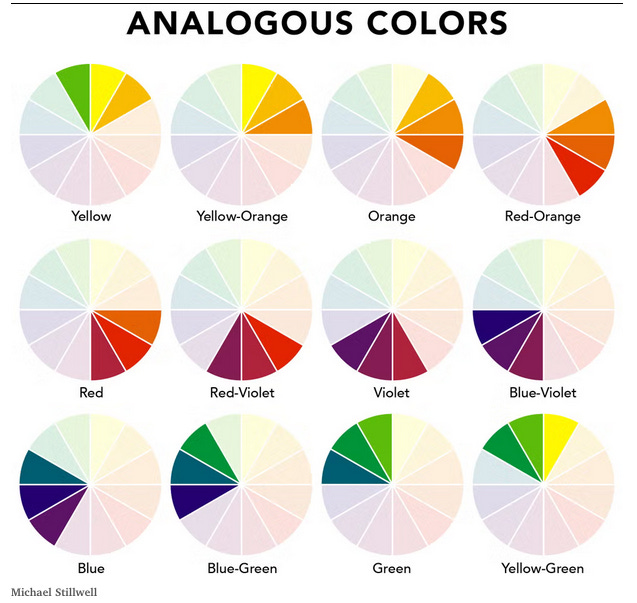

Analogous Colours
While using 1complementary colours in your image shouts for attention like a loud party guest, using analogous colours is more like the quiet mate who knows how to put everyone at ease.
These colours will enhance the composition, rather than fight for the spotlight, and give your image a far more down-to-earth vibe.
It’s something I often use when it comes to editing a shot that I’ve taken on location and don’t have control over the colour of the props.
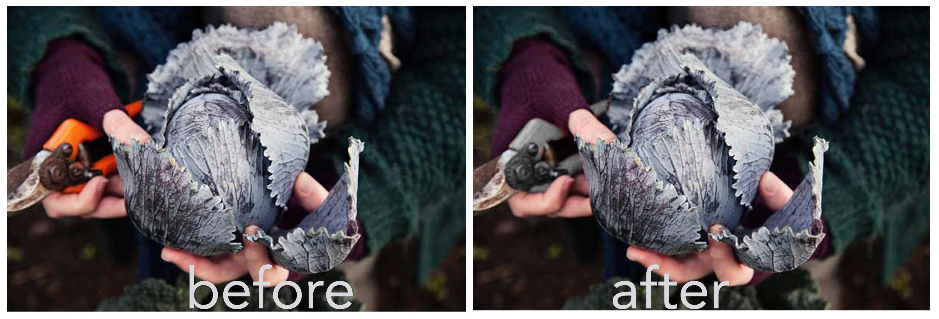

Both of the versions above work in their own right, but the decision to take away the bright orange element was simply another layer within the choices I made as the photographer to say what I wanted to to say within the shot. I like them both in different ways, but I felt the version on the right sat better within the brief about growing and harvesting your own veg in winter.
Using Reds, oranges and yellow can be really warm and inviting

©Kirstie Young
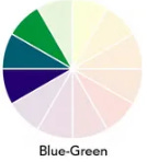
Blues and greens can feel calming

©Kirstie Young
Greens, browns and mustards can give your image a real honest earthiness

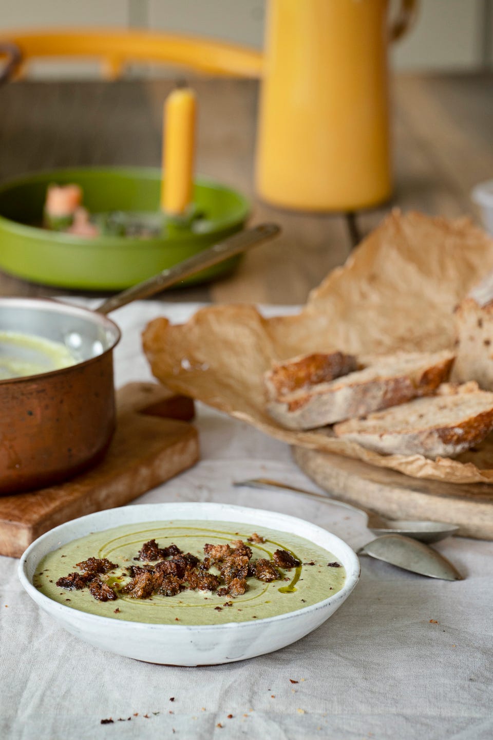
©Kirstie Young
Food brands employ colour psychology all the time.
The corporate behemoth that is McDonald’s understand this way too well. The logo across the US is still Red/Yellow, suggesting warmth and happiness (!) but they have changed their branding in some European cities to green, a nod to the growing wellness market, and signalling a more eco friendly, honest brand. Whether their actions match their branding is a conversation for another time ...


I do love writing these posts, but would love to reach a wider audience and so if you have enjoyed this one and found it useful I would absolutely love you to please share it:
add a comment:
or become a paid subscriber for less than a £1/week (hitting the button does not commit you to anything, it simply takes you to the options)
Cookbook Club
Next week my Substack post will be a roundup of how my first Cookbook Club went, so if you haven’t planned to your own version yet, there’s still time. For anyone who missed last weeks post - New this year is an online Monthly Cookbook Club for Subscribers. The idea is that you interpret this club however you see fit -
- You can choose to simply cook one element to enjoy solo;
- You could turn it into an in-person club by inviting a gang of people each tasked with bringing one of the dishes as a pot luck style dinner
- You can spend an evening cooking some of the dishes together with friends and then eating your feast together.
I will make the last post of each month a round up of how my own cookbook club went, with photos from the meal and notes on the recipes.
Subscribers can then add in their own photos and notes in the comments to create one big beautiful feast from the whole Lens Soup community.
This months book choice is:
Made in India by Meera Sodha and the suggested Menu is :
Starter: Pea Kachori, Lime Pickled Onions, Mint Yoghurt Chutney
Main: Fresh Spinach and Paneer Curry (V)
Pistachio and Yoghurt Chicken Curry
Chapattis or Naan
Dessert: Love Cake with Cardamom and Pomegranite
If you don’t have access to the actual book, the links to the recipes can be found by clicking on each course above.
Thanks for reading! If you enjoyed it, do please share this with your friends
Last weeks post:
Crack open the Crayons Pt1

I have to hold my hands up, I do love a neutral. Left to my own devices on a photoshoot, I will choose the mud-to-sawdust spectrum of colours, and if pushed, add a touch of algae.
I think I rush colour sometimes or make it a lesser priority than I should. Hope you're still in that calm and quiet corner! x